Focus Card
A container component that orchestrates hover animations for its children, managing shared hover state for image, overlay, and content.
Stacked & Scattered
Combine 3D transforms with the FocusCard to create tactile, interactive piles. This demo showcases how the card maintains its internal hover state (image scaling, content revealing) even when used as part of a complex CSS transformation. The thick border (using border-background) mimics a physical photo frame.


Text Reveal Effects
Create cinematic text entrances by combining blur and fade animations. This example demonstrates a high-fashion editorial card where the title reveals itself mysteriously, followed by a delayed slide-up for the supporting text and call-to-action.

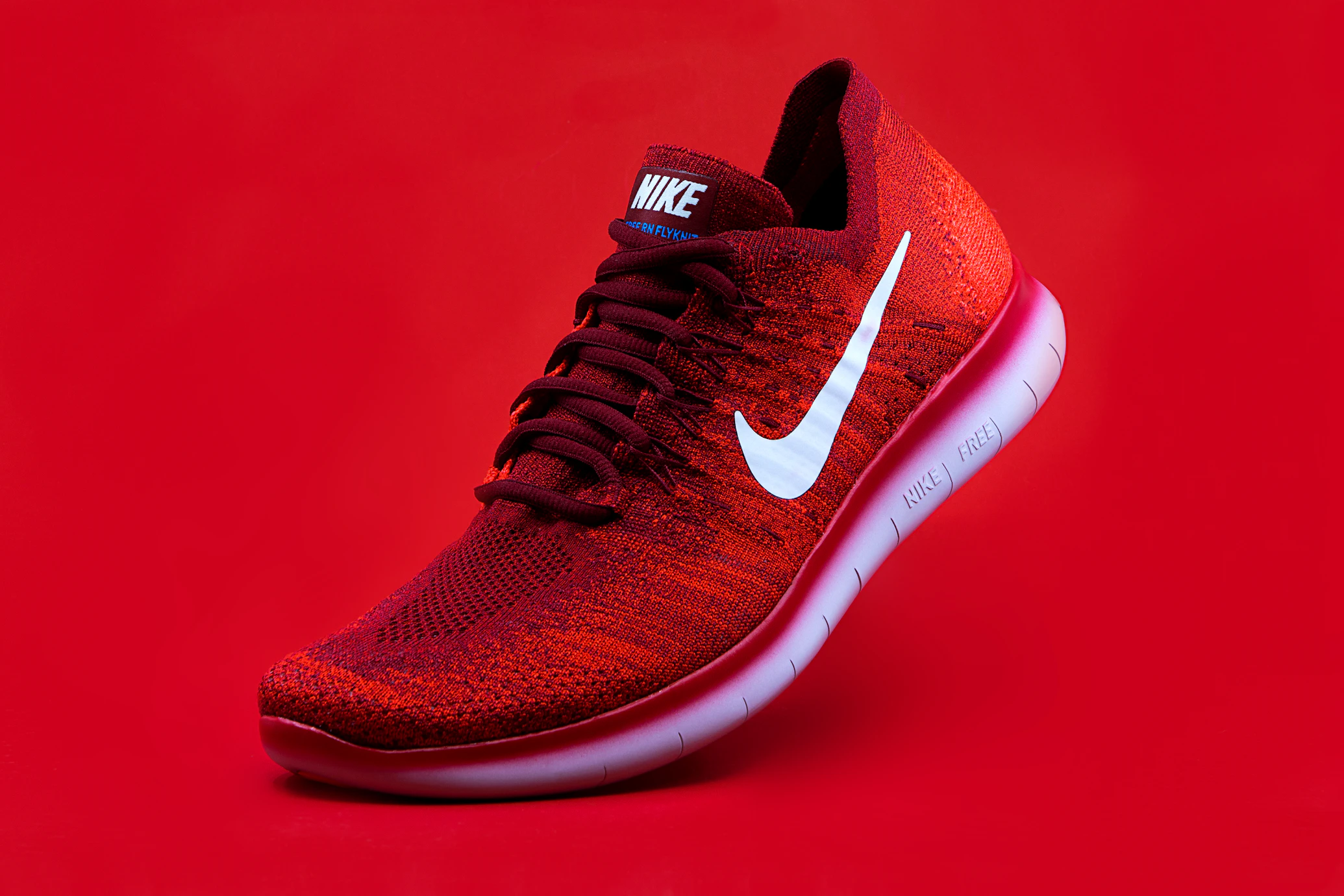
Album Art & Media
The aspect-square utility works perfectly with FocusCard for media-rich interfaces. This example replicates a music player card: hover to reveal playback controls (zoom entry) and track details (slide-up). The overlay effectively handles multiple content zones with different entry animations simultaneously.

E-commerce Product
Showcase products with a premium feel. This example utilizes the justify-between class on the overlay to distribute content into header, body, and footer sections. The diverse entry animations—sliding the badge from the top and price from the bottom—frame the product dynamically.
Installation
CLI (Recommended)
npx shadcn@latest add https://satisui.xyz/r/focus-card.jsonManual
- Install the required dependencies:
npm install motion
# or
yarn add motion
# or
pnpm add motion- Copy and paste the following code into your project at
components/satisui/focus-card.tsx:
'use client';

import React from 'react';
import { motion, HTMLMotionProps, Transition, Variants } from 'motion/react';
import { cn } from '@/lib/utils';

const transition: Transition = {
  duration: 0.4,
  ease: [0.25, 1, 0.5, 1] as const,
};

const imageVariants = {
  initial: {
    scale: 1,
    filter: 'blur(0px) brightness(1)',
  },
  hover: {
    scale: 1.05,
    filter: 'blur(5px) brightness(0.6)',
  },
};

const overlayVariants = {
  initial: { opacity: 0 },
  hover: { opacity: 1 },
};

const contentAnimations: Record<string, Variants> = {
  'slide-up': {
    initial: { y: 20, opacity: 0 },
    hover: { y: 0, opacity: 1 },
  },
  'slide-down': {
    initial: { y: -20, opacity: 0 },
    hover: { y: 0, opacity: 1 },
  },
  fade: {
    initial: { opacity: 0 },
    hover: { opacity: 1 },
  },
  zoom: {
    initial: { scale: 0.9, opacity: 0 },
    hover: { scale: 1, opacity: 1 },
  },
  blur: {
    initial: { filter: 'blur(10px)', opacity: 0 },
    hover: { filter: 'blur(0px)', opacity: 1 },
  },
};

interface FocusCardProps extends HTMLMotionProps<'div'> {
  children: React.ReactNode;
  className?: string;
}

/**
 * A container component that orchestrates hover animations for its children.
 * It manages the shared hover state for the image, overlay, and content.
 */
export const FocusCard = ({
  children,
  className,
  ...props
}: FocusCardProps) => {
  return (
    <motion.div
      initial='initial'
      whileHover='hover'
      animate='initial'
      transition={transition}
      className={cn(
        'group relative overflow-hidden rounded-[var(--radius)] bg-card border text-card-foreground shadow-sm w-full h-full min-h-[300px]',
        // FORCE: Hardware acceleration to prevent sub-pixel jitter during scale animations
        'transform-gpu translate-z-0',
        className
      )}
      {...props}
    >
      {children}
    </motion.div>
  );
};

interface FocusCardImageProps
  extends React.ImgHTMLAttributes<HTMLImageElement> {
  src: string;
  alt: string;
  className?: string;
}

/**
 * The background image component that scales up and dims on parent hover.
 */
export const FocusCardImage = ({
  src,
  alt,
  className,
  ...props
}: FocusCardImageProps) => {
  return (
    <motion.div
      variants={imageVariants}
      transition={transition}
      className={cn(
        'absolute inset-0 w-full h-full z-0',
        'will-change-[transform,filter] transform-gpu backface-hidden'
      )}
    >
      <img
        src={src}
        alt={alt}
        className={cn('w-full h-full object-cover', className)}
        {...props}
      />
    </motion.div>
  );
};

interface FocusCardOverlayProps extends HTMLMotionProps<'div'> {
  children: React.ReactNode;
  className?: string;
}

/**
 * An overlay layer that fades in on hover, typically used to provide contrast for text.
 */
export const FocusCardOverlay = ({
  children,
  className,
  ...props
}: FocusCardOverlayProps) => {
  return (
    <motion.div
      variants={overlayVariants}
      transition={transition}
      className={cn(
        'absolute inset-0 z-10 flex flex-col justify-end p-6',
        'bg-black/60 backdrop-blur-[2px] text-white',
        className
      )}
      {...props}
    >
      {children}
    </motion.div>
  );
};

interface FocusCardContentProps extends HTMLMotionProps<'div'> {
  children: React.ReactNode;
  className?: string;
  /**
   * The animation style for the content entry.
   * @default 'slide-up'
   */
  entry?: 'slide-up' | 'slide-down' | 'fade' | 'zoom' | 'blur';
  /**
   * Delay in seconds before the animation starts. Useful for staggering multiple elements.
   * @default 0
   */
  delay?: number;
}

/**
 * A wrapper for content that animates into view when the card is hovered.
 */
export const FocusCardContent = ({
  children,
  className,
  entry = 'slide-up',
  delay = 0,
  ...props
}: FocusCardContentProps) => {
  return (
    <motion.div
      variants={contentAnimations[entry]}
      transition={{
        duration: 0.4,
        ease: [0.25, 1, 0.5, 1],
        delay: delay,
      }}
      className={cn('w-full', 'will-change-[transform,opacity]', className)}
      {...props}
    >
      {children}
    </motion.div>
  );
};
Usage
Use the FocusCard component by composing its sub-components. You can customize the content entry animation using the entry prop on FocusCardContent.
import {
  FocusCard,
  FocusCardImage,
  FocusCardOverlay,
  FocusCardContent,
} from '@/components/focus-card';

export default function FocusCardDemo() {
  return (
    <div className='grid grid-cols-1 md:grid-cols-2 gap-6 p-10 max-w-4xl mx-auto'>
      {/* Default Usage: Slide Up */}
      <FocusCard>
        <FocusCardImage
          src='https://images.unsplash.com/photo-1579546929518-9e396f3cc809?w=800&q=80'
          alt='Abstract Gradient'
        />
        <FocusCardOverlay>
          <FocusCardContent>
            <h3 className='text-xl font-bold'>Default Animation</h3>
            <p className='text-sm text-gray-200 mt-2'>
              This card uses the default slide-up animation.
            </p>
          </FocusCardContent>
        </FocusCardOverlay>
      </FocusCard>

      {/* Customized Usage: Zoom Entry with Delay */}
      <FocusCard>
        <FocusCardImage
          src='https://images.unsplash.com/photo-1614850523459-c2f4c699c52e?w=800&q=80'
          alt='Neon Lights'
        />
        <FocusCardOverlay>
          <FocusCardContent entry='zoom' delay={0.1}>
            <h3 className='text-xl font-bold'>Zoom Entry</h3>
            <p className='text-sm text-gray-200 mt-2'>
              Content zooms in with a 0.1s delay.
            </p>
          </FocusCardContent>
        </FocusCardOverlay>
      </FocusCard>
    </div>
  );
}
Props
FocusCardImage
| Prop | Type | Default | Description |
|---|---|---|---|
src | string | Required | The source URL for the background image. |
alt | string | Required | Alternative text for the image. |
className | string | - | Additional CSS classes for styling. |
FocusCardContent
| Prop | Type | Default | Description |
|---|---|---|---|
entry | 'slide-up' | 'slide-down' | 'fade' | 'zoom' | 'blur' | 'slide-up' | The animation style for the content entry. |
delay | number | 0 | Delay in seconds before the animation starts. |
children | ReactNode | Required | The content to be animated. |
className | string | - | Additional CSS classes for styling. |